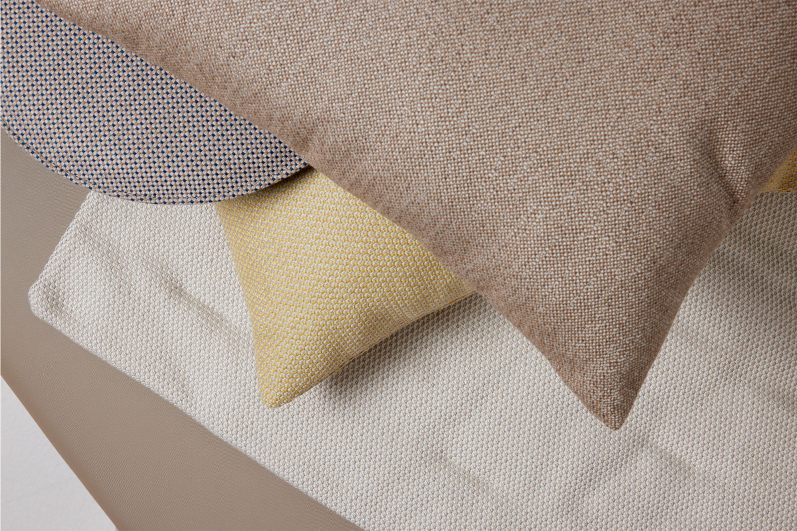
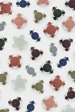
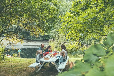
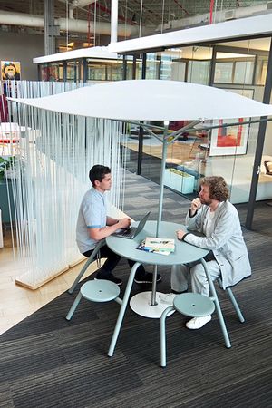
Our tireless search for purity and honesty has resulted in a color palette inspired by the furthest reaches of the globe. Starting from the elemental transparency of matte monochromes contrasted with brushed finishes in shades of white and grey… to the warmer tints and textures of terracotta and natural nuances in green… and the unmistakeably feminine inspiration of cool, sculptural tints…
The color of authenticity
Colorful environment
|
Extremis’ products shouldn't showboat. We want our furniture to attract people while blending seamlessly with any setting. Natural materials like wood or anodised aluminium do just that. But the right colors are equally important. Our color professionals have defined a color range in combination with our basic, pure materials. As our tools for togetherness are used both outdoors and indoors, it was quite a challenge to create a compact, yet complete color scheme. Our new range follows three different color concepts or attitudes, that you can discover while scrolling down this page. These concepts are based on the following aspects of color selection: preservation, maintenance, environment and climate.
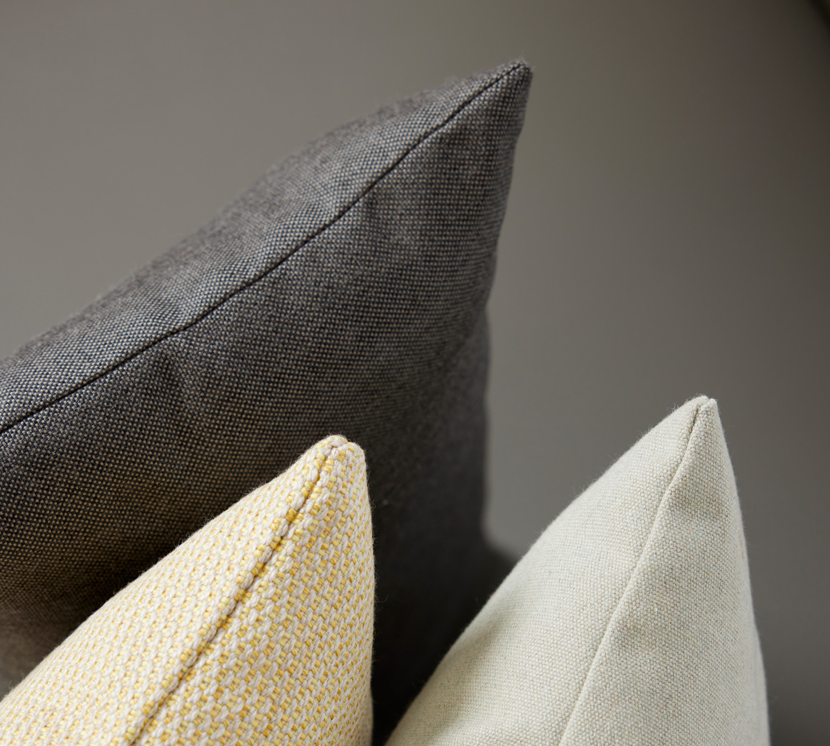
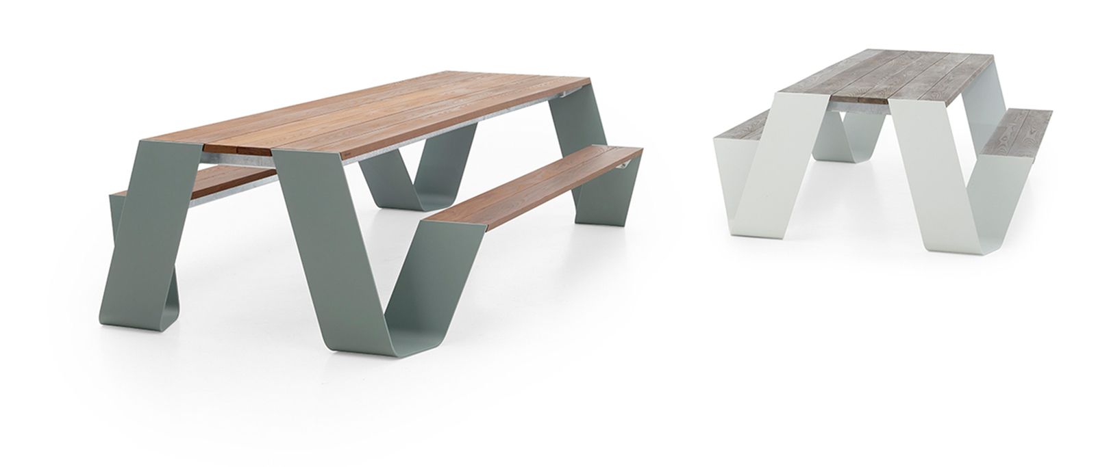
Choose colors that stand the test of time Our tools are designed to last a lifetime. That’s why our bigger products don’t contain any trendy color schemes. After all, you want a color that can stand the test of time, and that won’t feel dated immediately. Neutral colors are often combined with wood. The wood reveals its true personality after a while, as it starts to fade and turn silvery grey when exposed to sun and rain. Trendy colors can be added as a decorative element, for example as a cushion that can be replaced from time to time. You can explore them in our fabric range. Choose colors that minimize maintenance Furniture should require as little maintenance as possible. That’s why we design, choose materials and pick colors with the laziest person in mind. Within our range some colours require more maintenance than others. A white Hopper leg needs more cleaning than a black one. It's as simple as that. We added some earthy, natural colors to our range to offer more maintenance-friendly options. Choose colors that pop out or blend in When picking a product or a color, it should match the surrounding architecture and colour palette. The furniture can set the tone while silently fading into the background, outdoors and indoors. Choose colors according to your climate For a large part, color determines the temperature of a piece of furniture. Dark colors absorb the sunlight and heat up the surface. For some climates, this can be an advantage, but in warmer regions light colors will be more appropriate. A rainy and humid climate will also affect your choice of color – or at least, it should! |
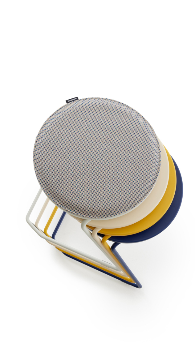
Our colors attempt to strike that delicate balance between presence and absence. They should speak to us while at the same time silently fading into the background.

Colors capable of inspiring without imposing, offer a blank canvas for the art of living.
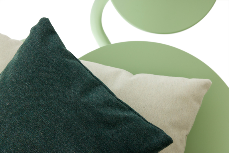
Out of the Fjordinary
A boreal and montane togetherness biome
We translated the northern biomes into a balanced color palette, transcending the ordinary through a blend of nature’s most incredible beauty
Forest & Fields
A green and rural togetherness biome
Rooted in West-Flemish tradition, we blend temperate forest elements - the main European biome - with local clay and hay for a unique touch
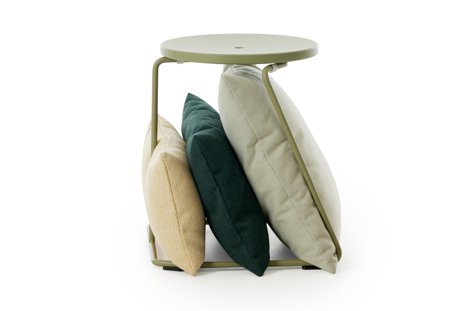
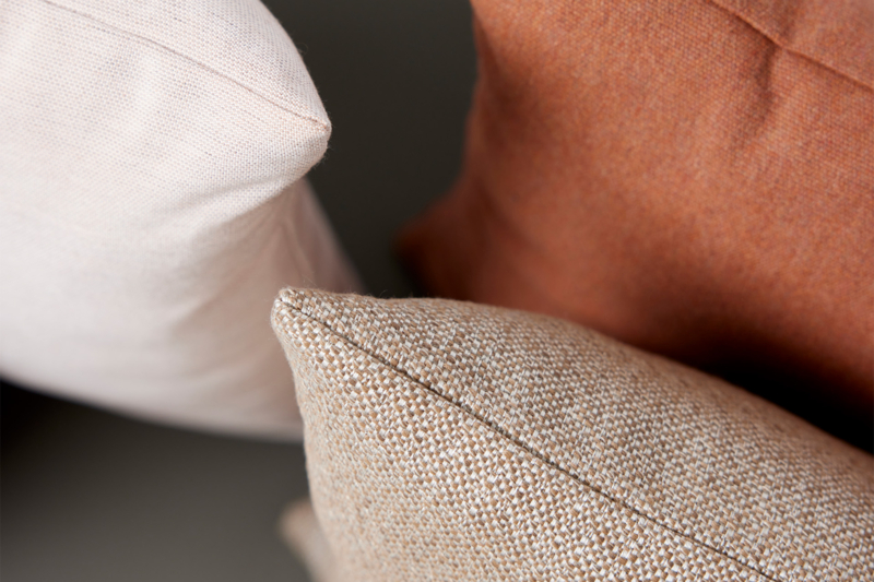
A Lotta Terracotta
A mediterranean togetherness biome
Welcome to warm earthy tones and terracotta red shores: this is just the perfect holiday color palette
Majestic Mirage
A sandy and breezy togetherness biome
Embark on a captivating nighttime escapade where gentle hues of yellows and rich accents cast a mesmerizing allure over the dunes
