AZ Zeno Knokke
Knokke, Belgium
In projects, Hopper, Pantagruel
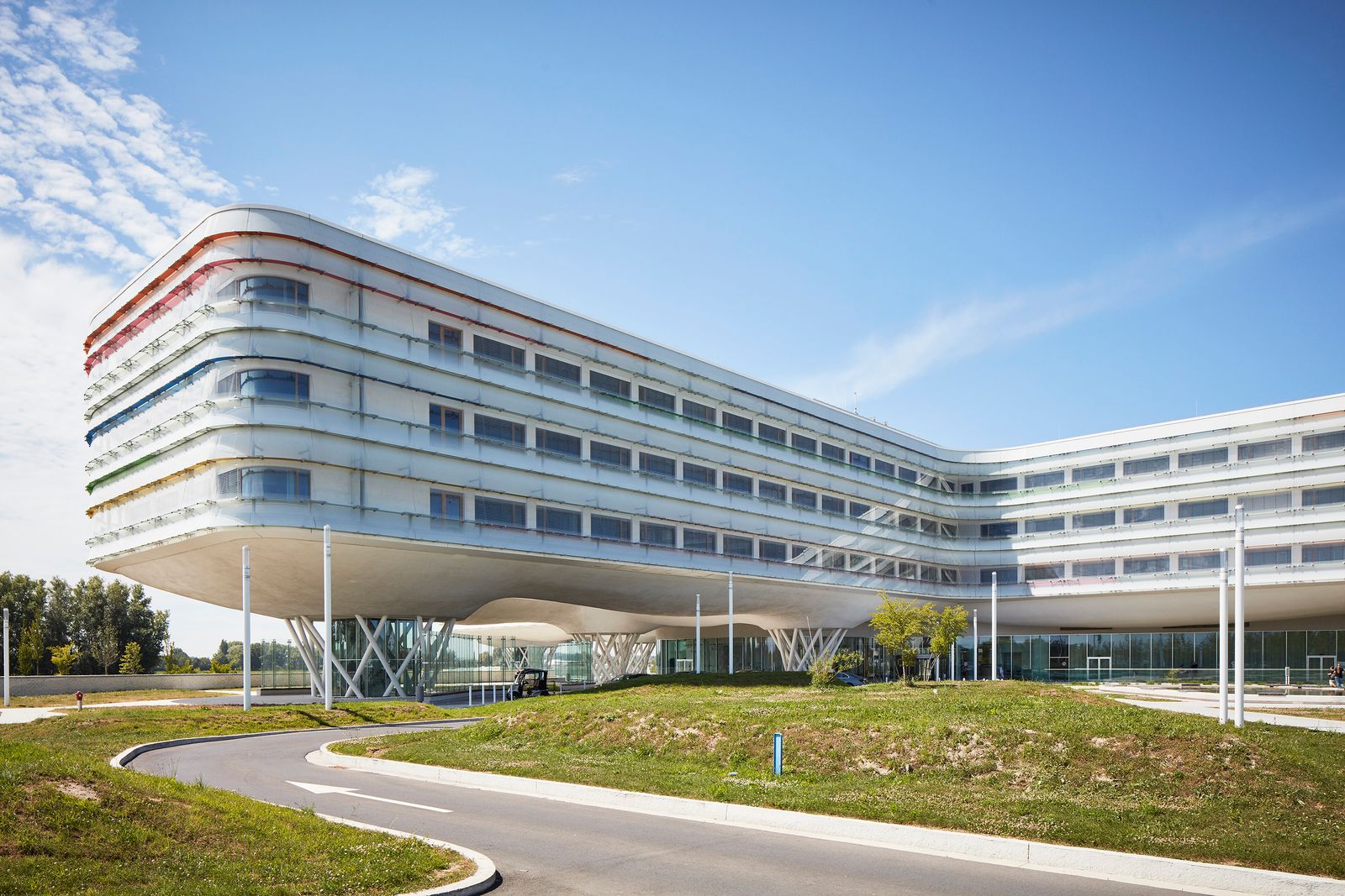
As you pass through Knokke-Heist, a seaside town in Belgium, a futuristic building grabs your attention. The eye-catcher is the hospital, and it has won a prestigious award at the World Architecture Festival in Amsterdam. Maybe choosing Extremis furniture had something to do with that?
In 2007, the hospital organized a competition for architects to come up with a design for a new hospital. Three Belgian architecture firms (AAPROG, Boeckx and B2Ai architects) teamed up and won this competition. Eleven years later, the building was opened and reviews are stunning. We were very curious about the why, how, and what of this building, so we sat down with Pieterjan Vermoortel (CEO at B2Ai architects) and asked him everything about it.
Thoughtful choices from A to Z
“The building is inspired by the surrealistic work of René Magritte. It looks like it’s floating above the landscape with light and nature dominating the entire building, top-down and bottom-up,” according to Vermoortel. “The seamless transitions between outside and inside, private and public spaces results in an inviting and inspiring building”.
What about the choice of materials?
"The main goal was to get a very bright building with colorful accents here and there. That’s why we chose white as the background. White is a contemporary color and serves as the perfect basis for the rest of the interior design. We chose for light basic colors and some wooden accents."
Why did you make the choice for Extremis furniture?
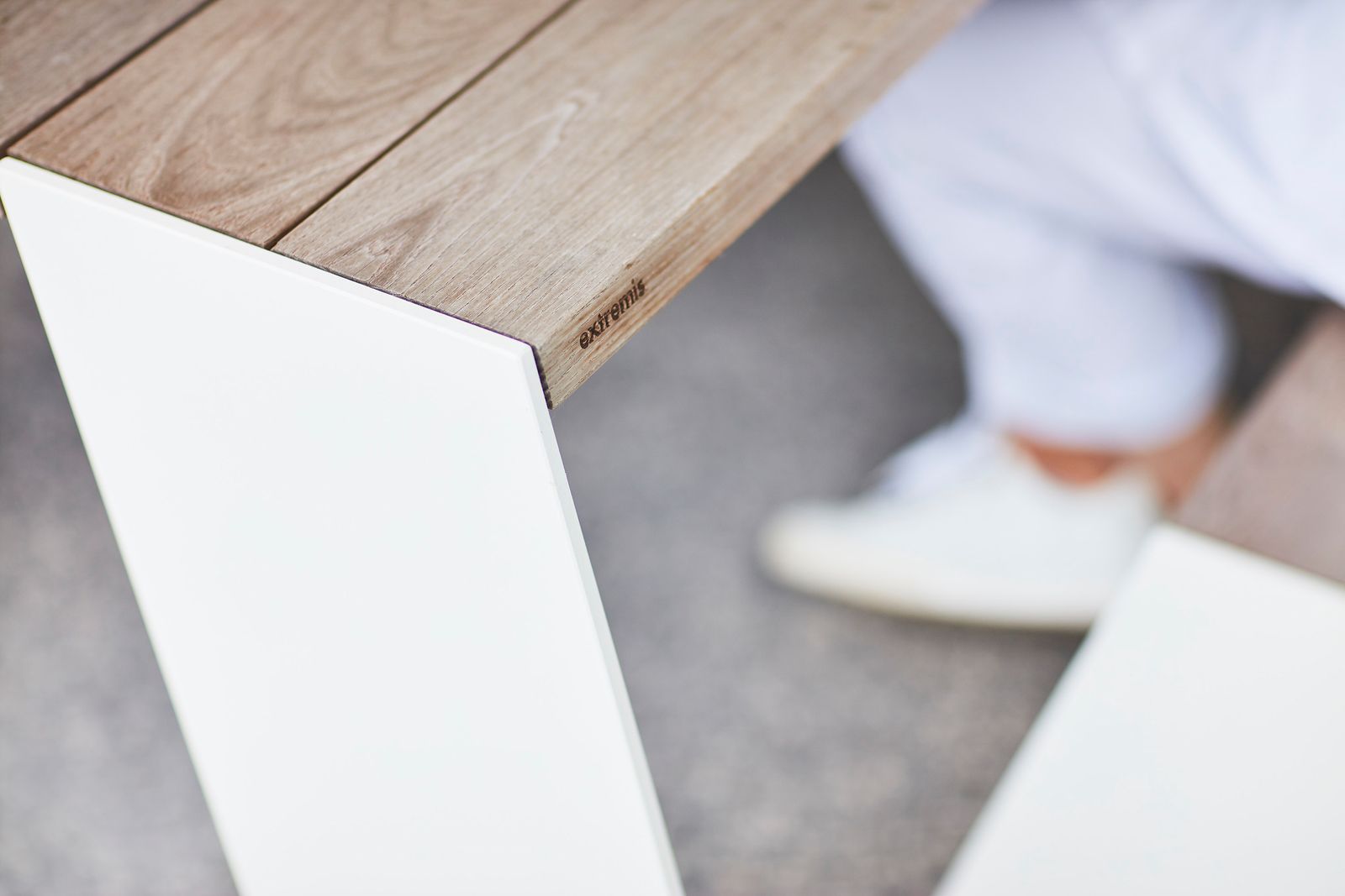
"We chose Extremis because their vision suits this project very well: furniture with a strong personality, well-considered features, and high quality design,” shares Vermoortel. “Because of the fast-changing weather conditions and powerful wind, sustainable materials are very important when designing a project near the coast. Extremis is an established Belgian brand and has a widely-known service record. That’s why the choice for Extremis furniture was an easy one."
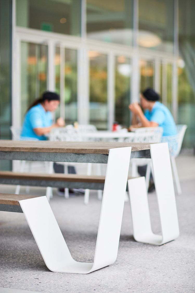
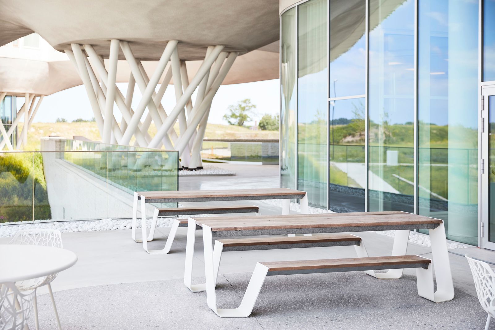
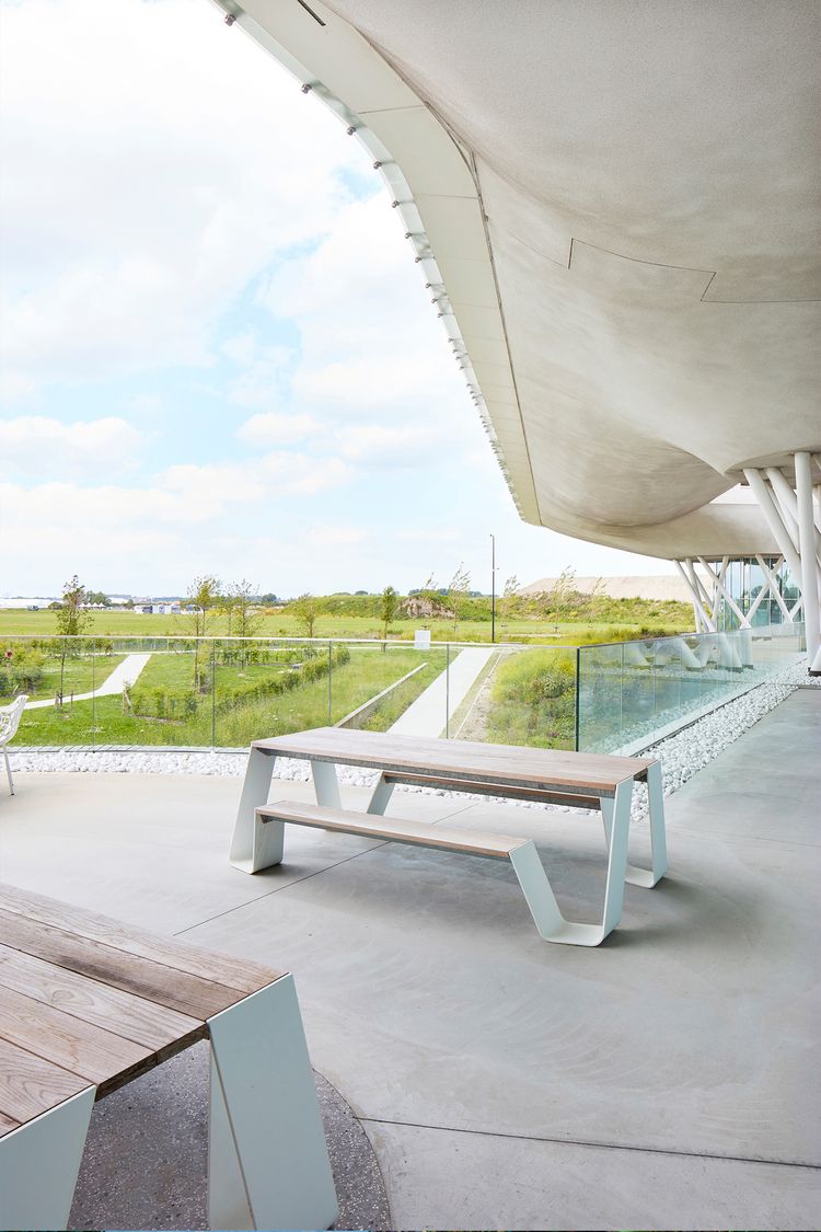
"The Hopper picnic tables were placed on the restaurant terrace because they offer great accessibility. There is plenty of room at the head of the table for a wheelchair. Vermoortel adds: “Co-workers love to lunch, relax and even hold meetings at the Hopper.”
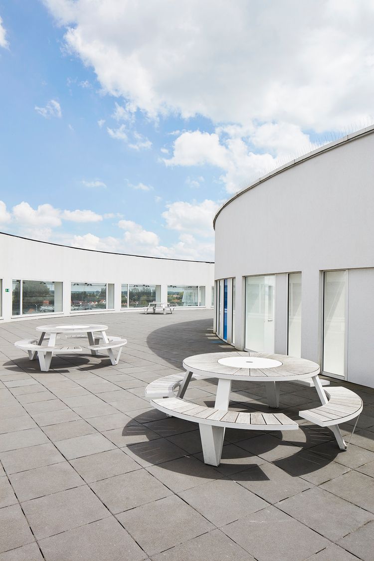
On the psychiatric department terrace, we opted for the ultimate piece of togetherness (in our eyes). We were looking into solutions that enhance eye contact between everyone at the table. The round Pantagruel was the perfect solution for this.
Do you see AZ Zeno as an example of biophilic design?
"Well, having access to natural light and being in contact with a green environment has a major impact on the healing process for a patient. Actually, it is beneficial for everyone. It can reduce stress, boost your productivity and contribute to overall wellbeing. Stacking the interior with plants and greens may not be the ideal solution, says Vermoortel with a chuckle."
"Because of the sophisticated architecture, you can enjoy nature from inside the building. Therefore, we preferred to have a hospital in a green environment rather than a building in the city without greenery or daylight. Vermoortel concludes: “We designed this building with the users and their relationship with the environment in mind”.
“I truly believe that AZ Zeno is the ultimate example of biophilic design."


AZ Zeno is the ultimate example of biophilic design because it was designed with the users and their relationship with the environment in mind.
